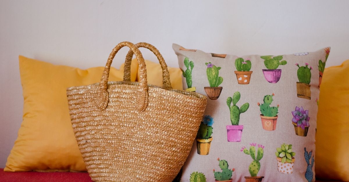
Pillows are the smallest, smartest color moves you can make. They help you test trends, add depth, and tie together the tones already living in your space. Below, you’ll learn how to plan a color palette, translate design theory into practical choices, and avoid common pitfalls—so every cushion you place feels like it belongs.
Why Pillows Matter: Small Pieces, Big Impact
While paint and sofas get all the attention, pillows are the color control knobs of a room. They’re flexible, affordable, and endlessly swappable—perfect for refining your palette without committing to permanent changes.
- Low risk, high reward: Swap covers seasonally or whenever your mood changes.
- Color psychology on demand: Warmer hues can energize; cooler palettes calm and soothe.
- Bridge builder: Pillows connect your rug, art, curtains, and sofa into a cohesive whole.
- Texture translators: Linen, velvet, bouclé, and knits add dimension even within the same color family.
Start With a Strategy
Before buying anything, set your direction. Good styling follows a plan—one that respects your fixed elements, lighting, and the mood you want to create.
Read the Room: Fixed Elements, Undertones, and Light
- Fixed elements: Note your sofa, rug, flooring, stone, wood stains, and major artwork. These anchor your palette.
- Undertones: Grays can lean green, blue, or purple; beiges tilt pink or yellow. Pillows should echo or deliberately contrast these undertones.
- Lighting: North light cools colors; south light warms them. Evening bulbs shift hues. Test pillow covers in morning and evening for accuracy.
Set the Mood: Warm vs. Cool, Calm vs. Energizing
- Warm palettes (terracotta, ochre, rust, coral) feel cozy and inviting—ideal for living spaces.
- Cool palettes (sage, teal, navy, dusty blue) feel airy and serene—great for bedrooms and studies.
- Balanced palettes pair warm and cool for depth and sophistication.
Choose a Base: Neutrals Plus Accents
Make a neutral base work for you. A neutral base (greige, taupe, cream, charcoal) lets you rotate accents easily while keeping the room calm and cohesive.
- 60-30-10 rule: 60% dominant (sofa/rug/walls), 30% secondary (curtains/throws), 10% accent (pillows/art). Adjust to 70-20-10 in small spaces for simplicity.
- Texture as color: Treat texture like a color; matte vs. lustrous finishes change how shades read.
Pick a Color Harmony
- Monochromatic: One hue in varied tints/shades (e.g., navy, denim, sky). Quiet, sophisticated, easy to layer.
- Analogous: Neighbors on the color wheel (olive, sage, teal). Feels curated and organic.
- Complementary: Opposites attract (blue and orange; green and red). High contrast, energetic—use thoughtful proportions.
- Split-complementary: A main color plus two near the opposite (teal with coral and mustard). Vibrant yet balanced.
- Triadic: Three evenly spaced hues (navy, rust, forest). Bold and modern; keep one dominant.
Building Your Palette Step by Step
The 60-30-10 (or 70-20-10) Formula for Textiles
When your sofa is neutral, use your pillows to deliver the 10% accent. If your sofa is bold, let pillows play the 30% role—mediating strong color with grounding neutrals and a single bright note.
Choose 1–3 Hero Colors and Support With Neutrals
- Hero color(s): 1–2 hues you love and want noticed first (e.g., emerald, rust).
- Supportive neutrals: Cream, camel, charcoal, warm white, black-brown—stabilize the look.
- Connector tones: Pull a small color from your rug or art to unite the scheme.
Use Texture, Pattern, and Scale
- Texture: Mix nubby linen, plush velvet, smooth cotton, wool knits, and bouclé for dimension.
- Pattern scale: Combine one large-scale print, one medium geometric/stripe, and one small texture or solid.
- Finish: Matte fabrics absorb light; satin and velvet bounce it—use to shift intensity without changing hue.
Finishes and Materials
- Velvet: Deepens jewel tones; looks luxe in evening light.
- Linen: Softens bold hues; breathes well in warm climates.
- Wool/bouclé: Adds cozy volume; perfect for winter palettes.
- Metallic accents: Thread or piping in brass, pewter, or champagne as subtle sparkle.
Decorative pillows–how to choose colors for your interior
Here’s a practical roadmap for decorative pillows–how to choose colors for your interior in a way that feels natural and tailored to your home.
- Identify your anchors: Pick 2–3 colors already present (from a rug, artwork, or wood/stone undertones).
- Decide the mood: Cozy and intimate (warm), or calm and airy (cool)?
- Select a harmony: Monochromatic for serenity, analogous for cohesion, or complementary for pop.
- Assign roles: Which color is dominant, secondary, and accent? Keep accents to your pillows.
- Test in real light: Order fabric swatches or covers; view them morning to evening.
- Balance pattern and texture: Vary scales and materials so the mix looks curated, not cluttered.
- Refine proportions: Start with a safe 70% neutrals, 30% color. Add or subtract saturation until the room “clicks.”
Lighting, Undertones, and Real-World Testing
- Day vs. night: A soft sage may gray-out under warm bulbs; a clay rust can glow. Check twice.
- Undertone match: Pair cool grays with blues/greens; pair warm beiges with terracotta/ochre.
- Grayscale trick: Photograph your pillow mix and apply a black-and-white filter. If values blur, add contrast (darker navy, brighter cream) so shapes read well.
- Bulb temperature: 2700–3000K adds warmth; 4000K reads neutral; high-CRI bulbs render colors more accurately.
Styling Scenarios and Case Studies
1) The Neutral Sofa Rescue
Challenge: Beige/gray sofa looks flat. Solution: Build an analogous green-blue story: sage linen, teal velvet, and a patterned cushion with cream and olive. Add a camel throw to warm the scheme. This introduces depth without overwhelming.
2) Bold Sofa, Balanced Mix
Challenge: Emerald sofa dominates. Solution: Use complementary warmth sparingly: rust velvet lumbar, cream bouclé pillows, and a micro-stripe in charcoal to ground. A hint of brass piping ties in metallic accents from a lamp.
3) Patterned Sofa Strategy
Challenge: Floral or plaid upholstery competes with pillows. Solution: Extract two colors from the upholstery pattern, then add solids or tiny textures. Keep one pillow echoing the sofa’s pattern scale, and the others quiet in texture.
4) Small Space, Big Cohesion
Challenge: Studio apartment with visual clutter. Solution: Monochromatic blues: navy, denim, sky. Use varying textures (linen, velvet, knit). Add a single leather lumbar for warmth and a small metallic thread for light play.
5) Family- and Pet-Friendly Choices
Challenge: Stains and wear. Solution: Performance fabrics in mid-tone colors (not too light, not too dark). Patterns with flecks visually hide marks. Choose zip-off covers; machine-washable where possible.
Style-Specific Palettes
Scandinavian Calm
- Base: Soft whites, pale gray, light oak.
- Accents: Dusty blue, warm beige, charcoal.
- Textures: Nubby linen, wool knit, cotton slub. Keep patterns minimal—pinstripes or micro-checks.
Coastal and Breezy
- Base: Crisp white, sandy taupe.
- Accents: Sea glass green, navy, indigo, soft coral.
- Textures: Washed linen, chambray, rope piping. Stripes and watercolor prints work beautifully.
Bohemian Eclectic
- Base: Cream, clay, natural wood.
- Accents: Saffron, magenta, teal, terracotta.
- Textures: Embroidery, tassels, kilim-inspired weaves. Anchor with one neutral to avoid visual noise.
Mid-Century Modern
- Base: Walnut, charcoal, ecru.
- Accents: Mustard, teal, burnt orange.
- Textures: Tweed, wool, velvet. Geometric prints and mod florals at medium scale.
Modern Farmhouse
- Base: Cream, warm gray, black accents.
- Accents: Olive, denim blue, rust.
- Textures: Linen, grain-sack stripes, leather. Mix small checks with solids for balance.
Luxe Glam
- Base: Deep charcoal, champagne, marble.
- Accents: Emerald, aubergine, sapphire, blush.
- Textures: Silk velvet, satin, subtle metallics. Keep patterns restrained; let sheen do the talking.
Seasonal Switches Without Starting Over
- Spring: Pastels (moss, blush, misty blue) in linen; add a floral or watercolor print.
- Summer: Crisp stripes, chambray, sea glass greens and nautical blues.
- Autumn: Earth tones (terracotta, rust, olive); tactile wools and bouclé.
- Winter: Jewel tones (emerald, garnet, sapphire) in velvet; metallic thread or piping for glow.
Keep a consistent neutral base and rotate 2–3 accent covers each season. Store off-season covers flat to avoid creasing.
Arrangement and Proportions
- Sofa size: 72–84 inch sofas typically suit 5 pillows; sectionals can handle 7–9; loveseats 3.
- Odd numbers rule: Groups of 3 or 5 look dynamic; symmetrical pairs feel formal. Choose based on your style.
- Vary sizes: 22–24 inch at the back, 20 inch in front, and a 12x20 lumbar to finish.
- Layering: Place solids or small textures at back, patterns and richer textures forward.
- Contrast: Ensure at least one light vs. dark and one warm vs. cool relationship so the arrangement has definition.
Common Mistakes (and Easy Fixes)
- Too matchy-matchy: If everything is the same color, add one contrasting hue or a high/low value shift (cream against navy).
- No texture variety: Combine matte and plush finishes for depth.
- Ignoring undertones: Yellow-beige pillows can clash with blue-gray sofas—pick greige or camel instead.
- All small patterns: Introduce a large-scale motif to break monotony.
- Overcrowding: Leave breathing room so cushions don’t hide your sofa’s shape.
Budget, Sustainability, and Sourcing
- Covers vs. inserts: Buy quality inserts once (down/feather blend or down-alternative for allergies) and rotate covers.
- Eco-minded: Look for recycled fibers, OEKO-TEX certified dyes, and Fair Trade artisans.
- Local makers: Custom covers let you match undertones precisely; bring your rug or wood sample to the shop.
- Care: Zip-off covers, spot-cleanable fabrics, and removable tassels extend lifespan.
Quick-Start Palettes and Formulas
Steal these ready-to-style combinations. Adjust saturation to match your room’s light.
- Soft Contrast Neutrals: Warm white linen, mushroom taupe, charcoal herringbone; add black piping.
- Olive + Clay + Cream: Earthy, sophisticated; pair with walnut wood and brass.
- Navy + Camel + Sky: Timeless coastal-modern; stripes welcome.
- Emerald + Blush + Champagne: Luxe yet fresh; velvet and satin shine here.
- Terracotta + Ochre + Sage: Desert modern; linen and woven textures keep it organic.
- Teal + Rust + Ivory: Complementary tension with warmth and clarity.
If you like hex codes, try these as starting points: emerald #157A6E, rust #B5543A, sage #A3B18A, navy #1F3B57, blush #E8C5C1, camel #B58E64. Always test in your light.
Frequently Asked Questions
How many colors should I use?
Two to three accent colors plus neutrals is a reliable sweet spot. One can be dominant; the others support.
Can I mix warm and cool colors?
Yes—balance is key. Pair a warm hue (rust) with a cool hue (teal) and anchor with a neutral (cream or charcoal).
What if my room already has multiple colors?
Choose a unifying undertone (warm or cool) and reduce saturation. Use pillows that repeat the quietest tones from your rug or art.
How do I mix patterns?
Use one large-scale, one medium, and one small/solid. Keep a shared color thread running through all three.
What insert fill is best?
Down/feather blend is plush and shapeable; down-alternative is hypoallergenic and holds structure. Oversize the insert by 2 inches for a tailored look.
How do I keep it from feeling cluttered?
Limit your accent palette, vary sizes, and maintain negative space. Edit ruthlessly—if a pillow doesn’t support the story, remove it.
Checklist: From Idea to Installation
- Audit the room: List fixed colors and undertones.
- Define the mood: Warm/cozy or cool/calm?
- Pick a harmony: Monochromatic, analogous, complementary, or triadic.
- Set proportions: 60-30-10 or 70-20-10.
- Select textures: Aim for 3+ distinct finishes.
- Curate 1–3 hero colors: Back them with considered neutrals.
- Order swatches or covers: Test day and night; use the grayscale check.
- Arrange and edit: Size, layering, and contrast. Photograph to evaluate.
Bringing It All Together
The secret to powerful pillows isn’t guesswork—it’s a clear plan. Start with what you own, decide how you want the space to feel, choose a color harmony, and let texture do as much talking as hue. If you follow the steps above—especially the lighting tests and proportion rules—you’ll know decorative pillows–how to choose colors for your interior with confidence. Small textiles, big transformation: that’s pillow power.
Bonus: Sample Room Recipes
Light Gray Sectional, Sunny Living Room
- Palette: Navy, camel, cream, micro-stripe charcoal.
- Textiles: Navy velvet 22", cream bouclé 22", camel leather 12x20, charcoal stripe 20".
- Why it works: High value contrast and warm/cool balance; textures add depth.
Warm Beige Sofa, Low-North Light
- Palette: Moss, terracotta, ivory, walnut.
- Textiles: Moss linen 24", ivory slub 22", terracotta velvet 20", patterned connector with walnut specks.
- Why it works: Warmer tones counteract cool daylight; mixed scale patterns stay controlled.
Navy Velvet Sofa, Open-Plan Loft
- Palette: Rust, blush, champagne, bone.
- Textiles: Rust velvet lumbar, blush linen 22", champagne satin piped 20", bone textured 24".
- Why it works: Complementary warmth enlivens navy; sheen variation adds sophistication.
Troubleshooting Fast
- Colors feel muddy: Increase contrast—swap one mid-tone for a lighter or darker value.
- Room feels cold: Add one warm accent (camel, brass piping, terracotta).
- Pillows compete with rug: Reduce saturation on pillows; echo one quiet hue from the rug.
- Too busy: Remove one pattern; keep texture instead.
Whether you lean minimalist or eclectic, these guidelines turn intuition into a repeatable process. With a plan, your pillows become more than accessories—they become the thread that ties your interior story together.